From click to request
For most guests, your website is the first glimpse of your venue. Strong images and clear room details are a good start, but they don’t always lead to enquiries. Often, visitors just need a small nudge to take the next step. These seven tips will help make your website feel more welcoming and more effective.
1. Keep your booking button easy to find
Nobody wants to waste time searching for a way to get in touch. If your booking button is hidden or unclear, visitors are likely to give up. Place it where it makes sense – on room pages, package details and in the site menu – and make sure it stays visible as people scroll.
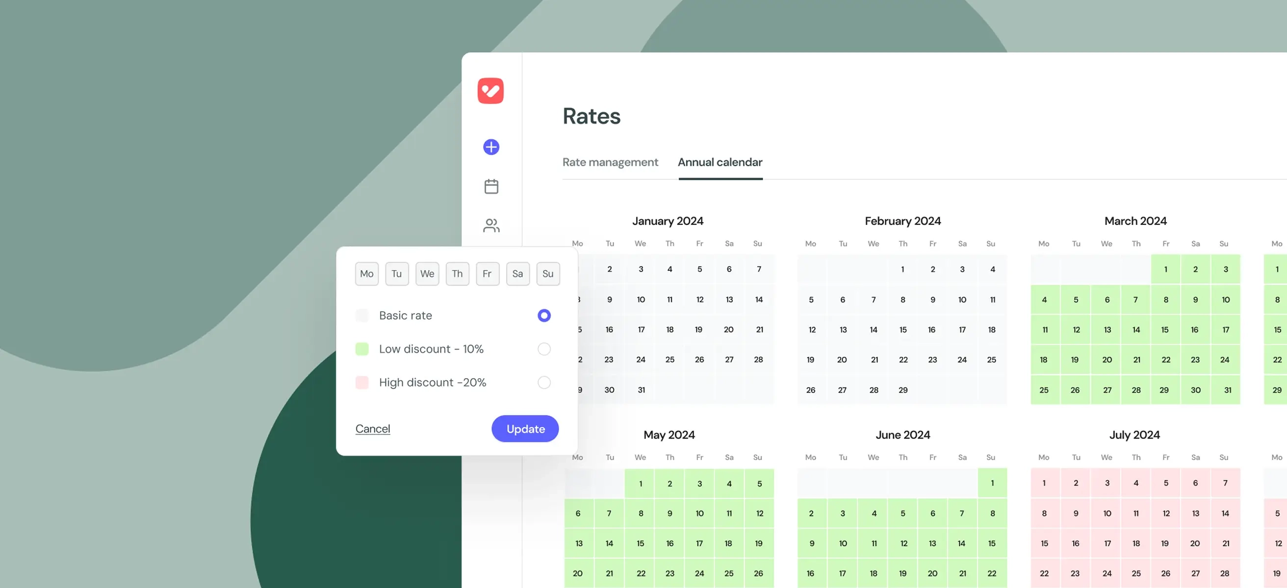
2. Be upfront with prices and availability
People want to know straight away whether your venue fits their plans and their budget. Showing availability and costs upfront saves them time and removes barriers. The fewer steps they have to take, the more likely they are to send a request there and then.
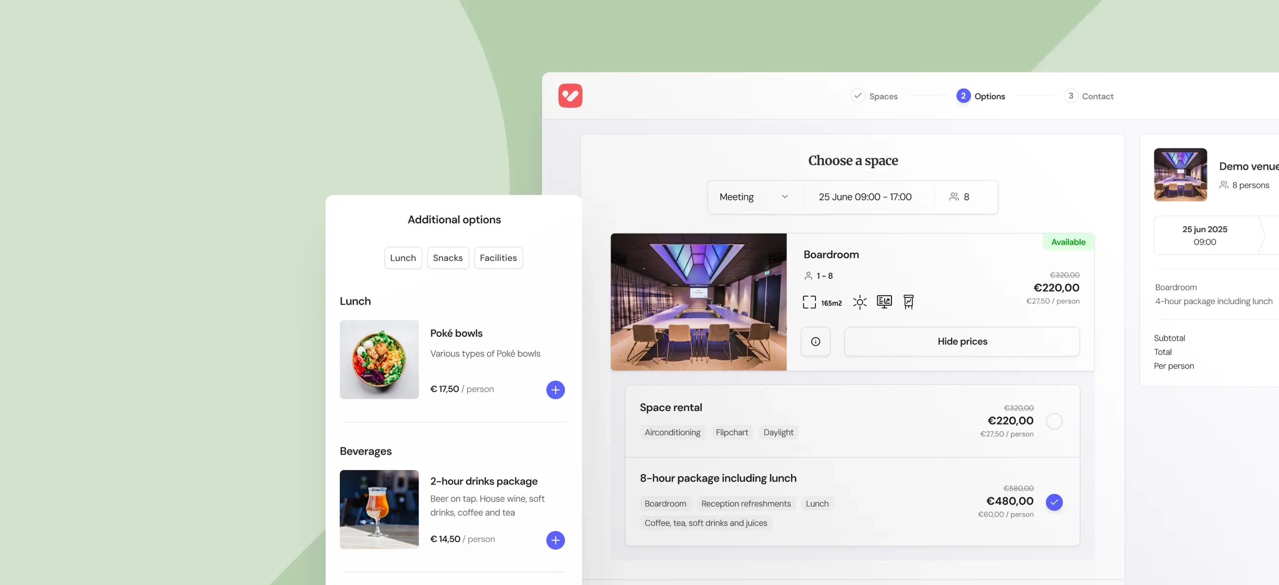
3. Switch to interactive proposals
Emailing a PDF feels clumsy and outdated. Interactive proposals (e-Proposals) are clearer, easier to browse and far more engaging. They bring everything together (text, images, packages and prices) in a professional online format. It’s a smoother experience for guests and makes it easier for them to say yes.
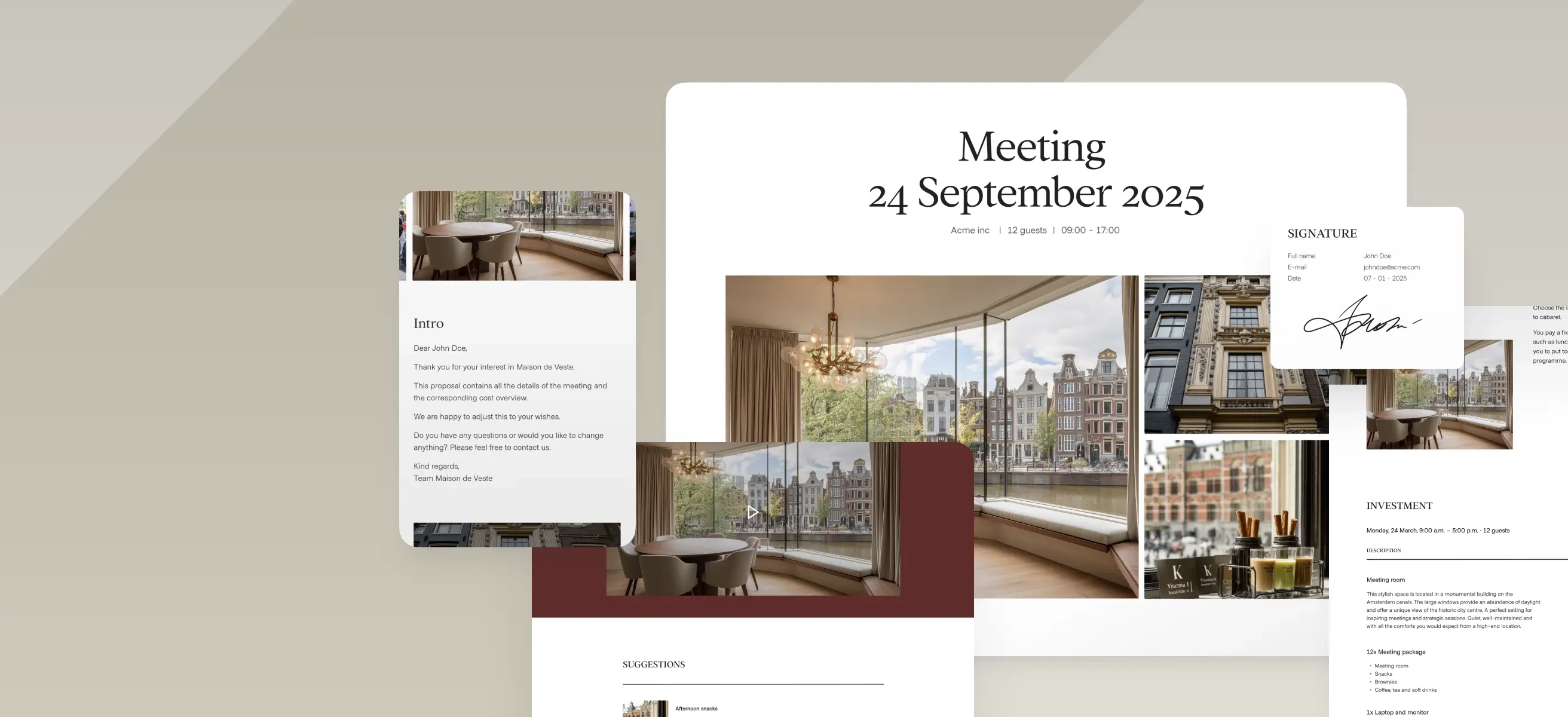
4. Showcase your venue with visuals
Pictures often tell the story better than words. Share shots of your rooms in different layouts, add a glimpse of a dinner in full swing, or include a short video tour. These visuals help people imagine their own event at your venue – and that impression lasts.
5. Keep forms short and straightforward
The longer the form, the greater the risk that people will abandon it. Ask only for the essentials you need to prepare a first proposal: date, number of guests and type of event. You can always gather more details later. Smart fields, such as dropdowns and auto-suggestions, make filling it in even quicker.
6. Offer the option to book online
We’re used to booking everything online – from flights to hotel rooms – and venues shouldn’t be an exception. Giving visitors the option to book straight away, or at least submit a quick enquiry, lowers the barrier. Even if they later prefer a detailed proposal, the process already feels simpler and faster.
7. Keep analysing and improving
A website is never truly finished. Look at where visitors drop off and which pages perform best. Small tweaks, such as a clearer button, a shorter line of text, a refreshed photo, can have a surprisingly big impact.
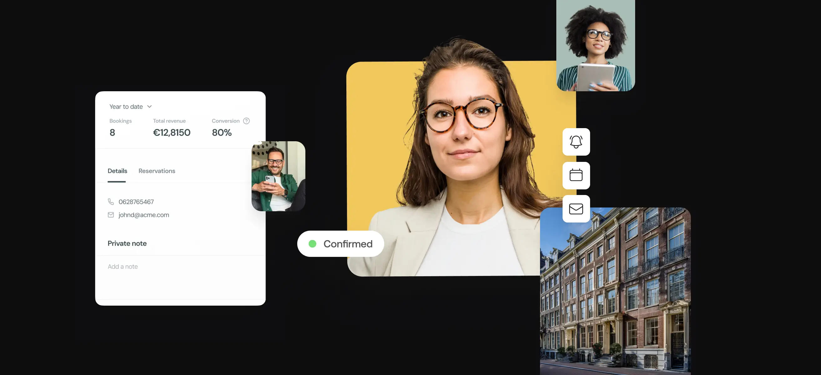
How VenueSuite makes things easier
All of these sound straightforward, but putting them into practice takes time. VenueSuite brings everything together in one platform: live pricing and availability, interactive digital proposals, an integrated enquiry and reservation system, and clear reporting. This means your website isn’t just a showcase, it becomes a real driver of enquiries.
More leads, fewer barriers
Your website should do more than simply look good. The clearer and more inviting it is, the more likely visitors are to get in touch. And often, it’s the small adjustments and not the big redesigns that make the biggest difference.
Interested in finding out which changes would have the most impact for your venue? Get in touch.